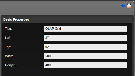
.Basic Properties
It will allow the user to configure the Title, Left, Top, Width and Height.
Display Objects
Following display objects are available for Data Warehouse
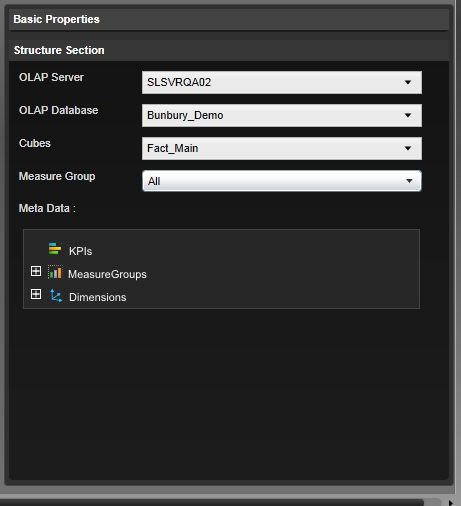
Structure section
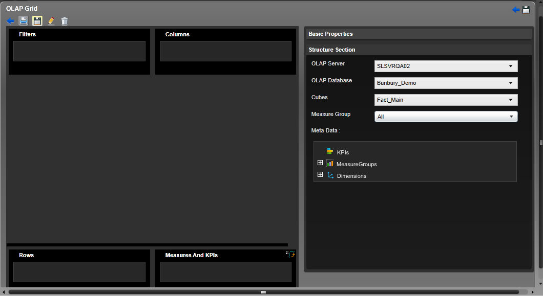
OLAP Data Grid
When a user drags and drops the OLAP Data Grid it will open up a blank grid. The left pane of the edit screen will allow the users to locate the selected KPIs and Measures, Filters, Rows or Columns in specific locations.
In the top left of the OLAP Data Grid control the users have the below options:
Server Name– This drop down will list all the database servers and the default selection is the first database server name of the list. When the user selects the server it should load the names of all the databases to the OLAP Database drop down.
OLAP Database – The user will see all the databases in the selected server in the drop down menu so that the user can select to which database which should get connected. This depends on the server selection and all the databases located in the server should get listed. The default selection should be the first element of the list. When the user selects the server it should load the names of all the cubes in the selected database to the Cubes drop down.
Cubes – This should be a mandatory selection. The drop down menu depends on the database which is selected in the OLAP Database section and the user should see all the cube names belong to the selected cube. The default selection should be the first element of the list.
Measure Group - This will load all the KPIs, Measures and Dimensions for selected measure group(s). The users will be able to select one or multiple measure groups.
Measures – Measures will be loaded based on the measure group(s) selected in the Measure Group selection. When the user clicks in the expand icon she/he should see measures related to the measure groups selected. The users should be able to drag and drop the measures to Measures/KPIs or Rows sections.
KPIs– This will be loaded based on the measure group(s) selected in the measure group selection. When the user clicks on the expand icon she/he should see related KPI's. The users should be able to drag and drop KPI's only to Measures/KPIs or Rows sections.
Dimensions – The identified dimensions should get loaded in the pane. These dimensions should differ based on the cube selected in the cube drop down. Clicking on the expand icon (+) should display further break down of the user defined hierarchies. The users must not be able to expand the attributes and it must be indicated using (-) sign.
Measures & KPIs - You can drag and drop KPI's and it will give you 4 columns( standard columns) - Services amount/Goal/status/Trend)
This will contain all the dragged and dropped KPIs and Measures with defined appropriate icons so that the users can distinguish the measures from KPIs.
The users should not be able to drag and drop dimensions to the Measures & KPIs section and the system should avoid this action by displaying the not allowed icon.
The users should be able to remove the selected KPIs or measures by clicking on ‘x’ sign
The users are not allowed to drag and drop the same dimension of the KPI multiple times and if your try to perform that action she/he must be restricted by showing the not allowed sign.
The users should be able to right click on the KPI and select all or required properties from Actual, Target, Status (Indicator) and Trend (Indicator). Default selection of the KPIs is Actual, target and status and these will be displayed as columns in to data grid.
The users should be able to right click on the KPI and select all or required properties from Actual, Target, Status (Indicator) and Trend (Indicator). Default selection of the KPIs should be Actual, target and status and these will get displayed as columns in to data grid.
Columns section -
This contains all the dragged and dropped user-defined hierarchies, or attributes of dimensions.
The dragged and dropped user-defined hierarchies or attributes of dimensions will display in the Columns section with its appropriate icons.
The users are able to remove the selected dimensions by clicking on ‘x’ sign.
The users are able to change the display sequence of the added items (user-defined hierarchies, or attributes) by using the up down arrow icons next to each item.
The users are restricted from adding the same dimensions, user-defined hierarchies, or attributes to both Rows section and Columns section. If particular dimensions, user-defined hierarchies, or attributes are added to the rows section the system will indicate to the users by displaying the not allowed icon.
A dimension can have one or many user definer hierarchies and attributes and when a user drag and drop a dimension all the members of the user definer hierarchies and attributes should be selected by default and the users should be able to select/deselect as desired.
Rows Section
This contains all the dragged and dropped user-defined hierarchies, attributes of dimensions, KPIs or Measures. A user dragging and dropping a dimension without expanding should add the default user-defined hierarchy.
The dragged and dropped user-defined hierarchies, attribute, KPIs or Measures will display in the Rows section with its appropriate icons.
The users will be able to change the display sequence of the added items (user-defined hierarchies, or attributes) by using the up down arrow icons next each item.
The users are able to see a menu containing Actual, Target, Status and Trend.
The users are able to add multiple user-defined hierarchies, or attributes of dimensions or KPIs or Measures to the Rows section.
The users are restricted from adding the same dimensions, user-defined hierarchies, or attributes to both Rows section and Columns section. If a particular dimensions, user-defined hierarchies, or attributes is added to the columns section the system should indicate that to the users by displaying the not allowed icon.
Filters
The users are able to drag and drop the user defined hierarchy(s) or attributes of dimensions to the filter section.
The users are able to add one or more filters to the Filter section.
Users are able to add the same user defined hierarchies and attributes of dimensions as filters is possible. System will filter data and show the filtered content in the grid based on filters whereas member filtering with grid itself hides deselected members but loads.
The users are not able to drag and drop KPIs or Measure as a filter section. If a user tries to perform this action she/he should be informed by displaying the not allowed icon.
The users are able to right click on the items added and view the hierarchy tree. It is required to display check boxes in front of each hierarchy member so that the users can select the members as desired.
The users are able to select and deselect the members of the hierarchy tree as filters. It is required to display check boxes in front of each hierarchy member so that the users can select the members as desired.
The data grid will change according to the selected filter criteria and change the content of the data grid.
The users are able to see the filters by clicking on the magnifying glass icon which will get added to the system after the user click on the save button and is viewing the data grid.
Below mentioned are the possible scenarios for the Data Grid:
Scenario 1
User can drag and drop Measures and KPIs to the Measures & KPIs section and make all the other sections empty.
Note:
I. The users are able to add one or more Measures and KPIs.
II. If a user selects a KPI it will add Actual, Target and Status values by default while measures will add Actual value.
III. The Actual, Target numeric values will display right aligned in the cell and the format will be based on the OLAP database.
IV. The status and trend will get displayed in the center of the cell.
V. The column sequence of the data grid will set to be Actual, Target, Status and Trend still its customisable as per user requires.
VI. The columns width is adjustable and system will save the users’ settings at any point the user change it.
VII. Both horizontal and vertical scroll bars will display based on the size of the grid.
VIII. When a user clicks on the save icon the edit section will disappear and it will show the grid in full screen.
IX. The values or the cells or both will be able to get a colour schema configured in the OLAP database.
· Measures & KPIs - Number of turnovers per month , Staff turnover rate
· Filters - Empty
· Columns - Empty
Rows – Empty
|
KPI Actual |
KPI Target |
KPI status |
Measure |
|
x |
x |
x |
x |
Scenario 2
User drags and drops Measures and KPIs to the Measures & KPIs section and dimensions to the Rows sections.
I. The users are able to add one or more KPI(s), measures or hierarchies and attributes of dimensions to appropriate areas and by adding the filters user will be able to filter the grid.
II. If a user selects a KPI it will add Actual, Target and Status values by default while measures will only add Actual value.
III. The Actual, Target and Trend numeric values will display right aligned in the cell and the format will be based on the OLAP database.
IV. The status will be displayed in the center of the cell.
V. The columns width will be adjustable and system will save the users’ settings.
VI. The members of hierarchies or attributes of dimensions selected to Rows section should be prefixed with “+” or “-"or “.” when shown in the grid, indicating whether they can be expanded or collapsed.
When they are displayed in the grid, expandable members are prefixed with “+” and once expanded, members of it will be loaded with relevant prefixes and the prefix of the expanded member will be changed to “-“. The prefix “.” will be used for none expendable members of hierarchies and attributes.
VII. The users are able to right click on the none expanded hierarchy members and select/deselect its members to be shown in the grid as desired.
VIII. The expanded members will get displayed properly intended.
IX. Both horizontal and vertical scroll bars will display based on the size of the grid.
X. If the user change the sequence of the items in Rows section the system will be able to adjust its display order in the grid and fulfil the new user requirement. This should reset and discard the previous selections.
XI. If the member in the grid is filtered then the system will indicate it to the users by using an icon.
Ex. If “ + All Years” member in the grid is filtered for 2002, 2003 out of 2001, 2002, 2003, 2004, 2005, the member should be shown as “ + All Years {Filter Icon}”.
· Measures & KPIs - Number of turnovers per month as measure , Staff turnover rate as KPI
· Filters - Empty
· Columns - Empty
· Rows – Year- Quarter - Month as Dimension
|
|
KPI Actual |
KPI Target |
KPI Status |
|
+ All Year |
x |
x |
x |
Scenario 3
User drags and drops Measures and KPIs to the Measures & KPIs section and Dimensions to the Columns and Rows sections.
I. The users are able to add one or more KPI(s), measures or dimensions to appropriate areas and by adding the filters user can filter the grid
II. The Actual, Target and Trend numeric values will display right aligned in the cell and the format will be based on the OLAP database.
III. The status will be displayed in the center of the cell.
IV. The columns width should be adjustable and system will save the users’ settings.
V. The members of hierarchies or attributes added to Columns section should be prefixed with “+” or “-“ or “.”
when shown in the grid, indicating whether they can be expanded or collapsed. When they are displayed in the grid, expandable members are prefixed with “+” and once expanded, members of it should be loaded with relevant prefixes and the prefix of the expanded member should get changed to “-“. The prefix “.” should be used for non expendable members of hierarchies and attributes.
VI. The users are able to right click on the none expanded hierarchy members and select/deselect its members to be shown in the grid as desired.
VII. The expanded members will get displayed properly intended.
VIII. Both horizontal and vertical scrollbars will display based on the size of the grid.
IX. If the user change the sequence of the items in Columns section the system will be able to adjust its display order in the grid and fulfil the new user requirement. This should reset and discard the previous selections.
X. If the grid member in the grid is filtered then the system will indicate it to the users by using an icon.
Ex. If “ + All Organization” member in the grid is filtered for DIR1, DIR3 out of DIR1, DIR2, DIR3, DIR4, DIR5, the member will be shown as “ + All organization {Filter Icon}”.
· Measures & KPIs - Number of turnovers per month as measure , Staff turnover rate as KPI
· Filters - Empty
· Columns – Organization as Dimension
· Rows – Year- Quarter - Month as Dimension
|
|
+ All Organization |
||
|
KPI Actual |
KPI Target |
Measure |
|
|
+All Years |
x |
x |
x |
1. Delete– allows deleting the tab.
2. (+) icon– A user clicking on the (+) icon will allow the user to decide the type of the KPI user want to see in the data grid. The user will be allowed to select either or all from Actual, Trend, Target or the Status of the KPIs.
3. ‘SAVE’ icon – When a user clicks on the save icon the system will save the user settings and it will make the Edit section disappear and show the data grid in a new screen.
If you drag and drop KPI it will give you - 4 columns( standard columns - services amount/Goal/status/Trend)
KPI's and measures must not me mixed with each other.
When drag and KPI's then you will get multiple columns
There are four sections for configuring your widget - Measure group is a must. Simply drag and drop one measure one value - actual.
Filter option - will allow you filter by
Yellow - filtered
Rows -
Columns -
filter - ether hierarchies or attributes in filter
drag and drop You can add (attribution or hierarchies) Dimentions to rows
triangle - hierachies
drag and hierarchies -
Difference between placing attributes and hierarchies - hierarchies allow you to go drill down further.
You can analyse
ca
2. X- Axis
a. The users are able to drag and drop one user defined hierarchy or an attribute of dimensions.
b. The users are not allowed to drag and drop KPIs and measures.
c. The users are able to remove the items in X-Axis by clicking on ‘x’ sign.
d. The users will see an interchange icon in the top right corner of this section and clicking on the icon should interchange the axis from X to Y and vise-versa, and display the content accordingly.
1. Series
1. The system will allow the users to add only one user defined hierarchies or attributes of dimensions to the series section. The user will be restricted from adding multiple items for the series section by displaying the not allowed sign.
2. The users will be able to select either from Stack and Cluster option by clicking on the icon next to series title. The stack option will further allow the users to select either percentage or value and the bar chart must get drawn accordingly.
1. The users are able to add same dimension or two members of the same dimension to both series section and x-axis section.
1. Filters
a. The users will be able to drag and drop the user defined hierarchy(s) or attributes of dimensions to the filter section.
b. The users are able to add one or more filters to the Filter section.
c. System will filter data and show the filtered content in the grid based on filters whereas member filtering with chart itself hides deselected members.
d. The users are not be able to drag and drop KPIs or Measure as a filter section. If a user tries to perform this action user will be informed by displaying the not allowed icon.
The users must be able to drag and drop same dimension to filters section and X-axis section both.
Change the color:
The users are able to change the colours of either bar chart or the line chart and perform this action the users are provided with a colour palette. When the user clicks on change the colour it should show the colour palette.
OLAP Gauge control
OLAP Donut control
OLAP area control
OLAP Bubble control
Copyright © 2014-2015 CAMMS Online Help. All rights reserved.
Last revised: September 23, 2018